Content
1. Scatter plots
Scatter plots are extremely useful, they allows us to display the relationship between two quantitative variables. Suppose, we’re interested in the correlation covariance between bill_length_mm and the bill_depth_mm variables. In ggplot2 we always begin with the ggplot() function. Inside the ggplot() function, we specify the data inside the data parameter and the variables to consider for the plot inside the aes() function (which is itself inside ggplot()). After initializing the ggplot() function, we must specify which type of graph we want to generate. This is done using the geom_*() family function. Each geom corresponds to a specific graphic. The corresponding geom for a scatter plot is geom_point():
library(ggplot2)
## Warning: package 'ggplot2' was built under R version 4.1.3
library(palmerpenguins)
ggplot(data = penguins, aes(x = bill_length_mm, y = bill_depth_mm)) +
geom_point()
## Warning: Removed 2 rows containing missing values (geom_point).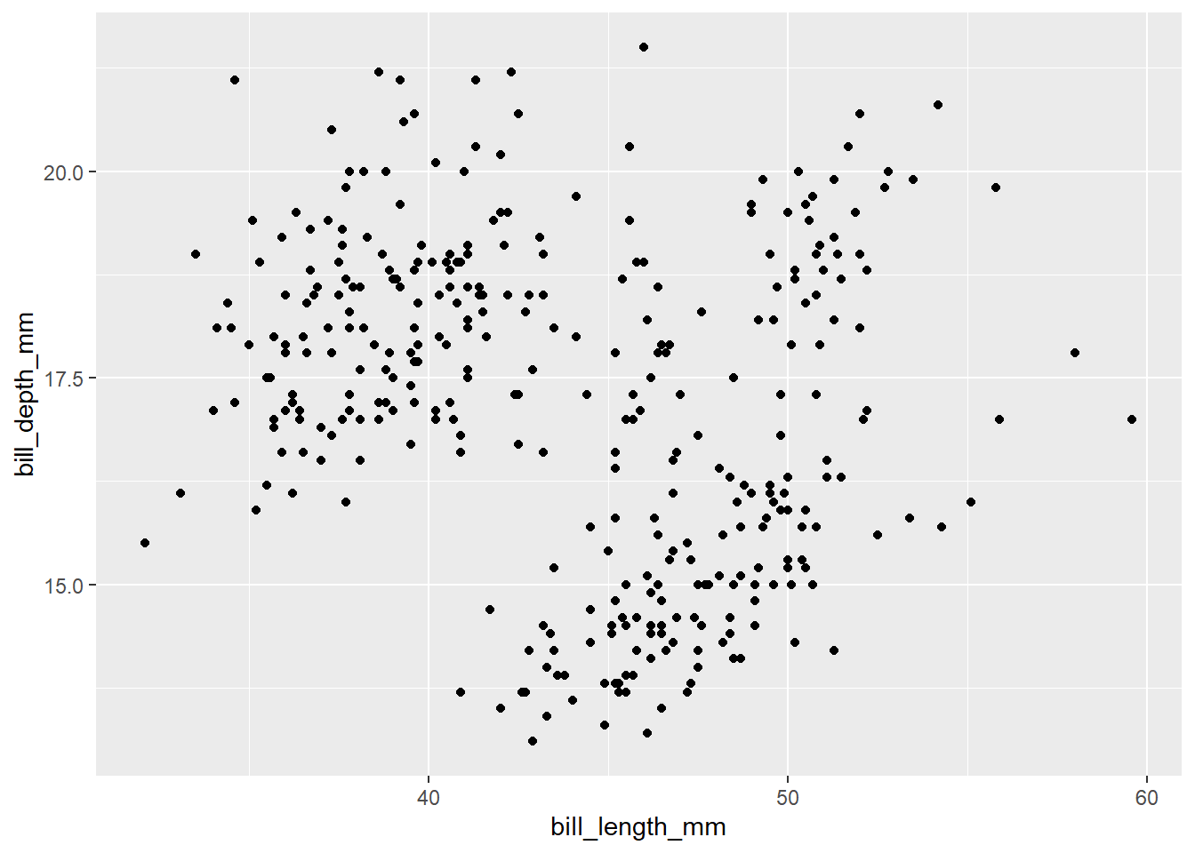
We can modify the absolute size of the dots using the size parameter which must be provided inside the geom_point() function:
ggplot(data = penguins, aes(x = bill_length_mm, y = bill_depth_mm)) +
  geom_point(size = 4)
## Warning: Removed 2 rows containing missing values (geom_point).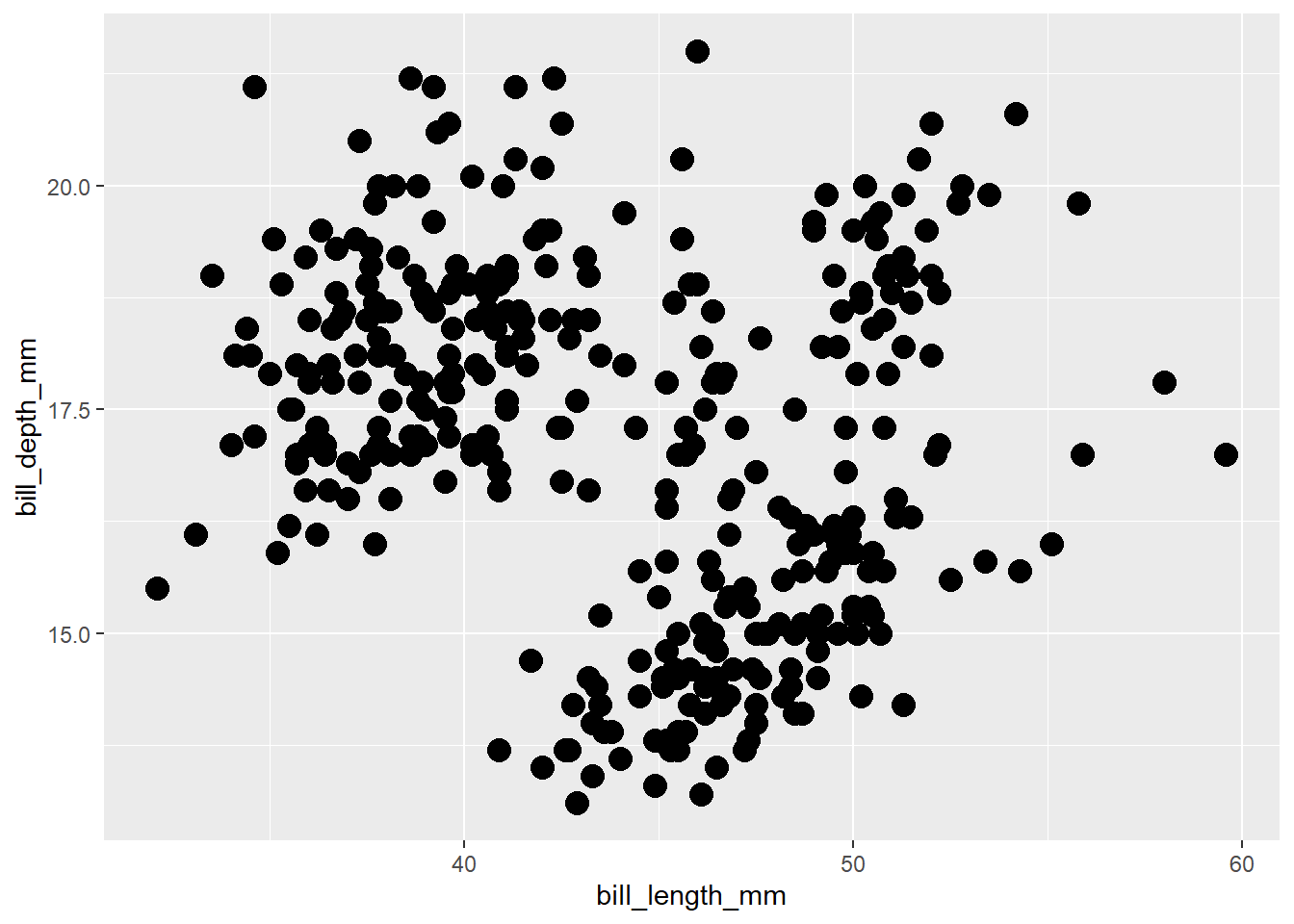
ggplot(data = penguins, aes(x = bill_length_mm, y = bill_depth_mm)) +
  geom_point(size = 0.5)
## Warning: Removed 2 rows containing missing values (geom_point).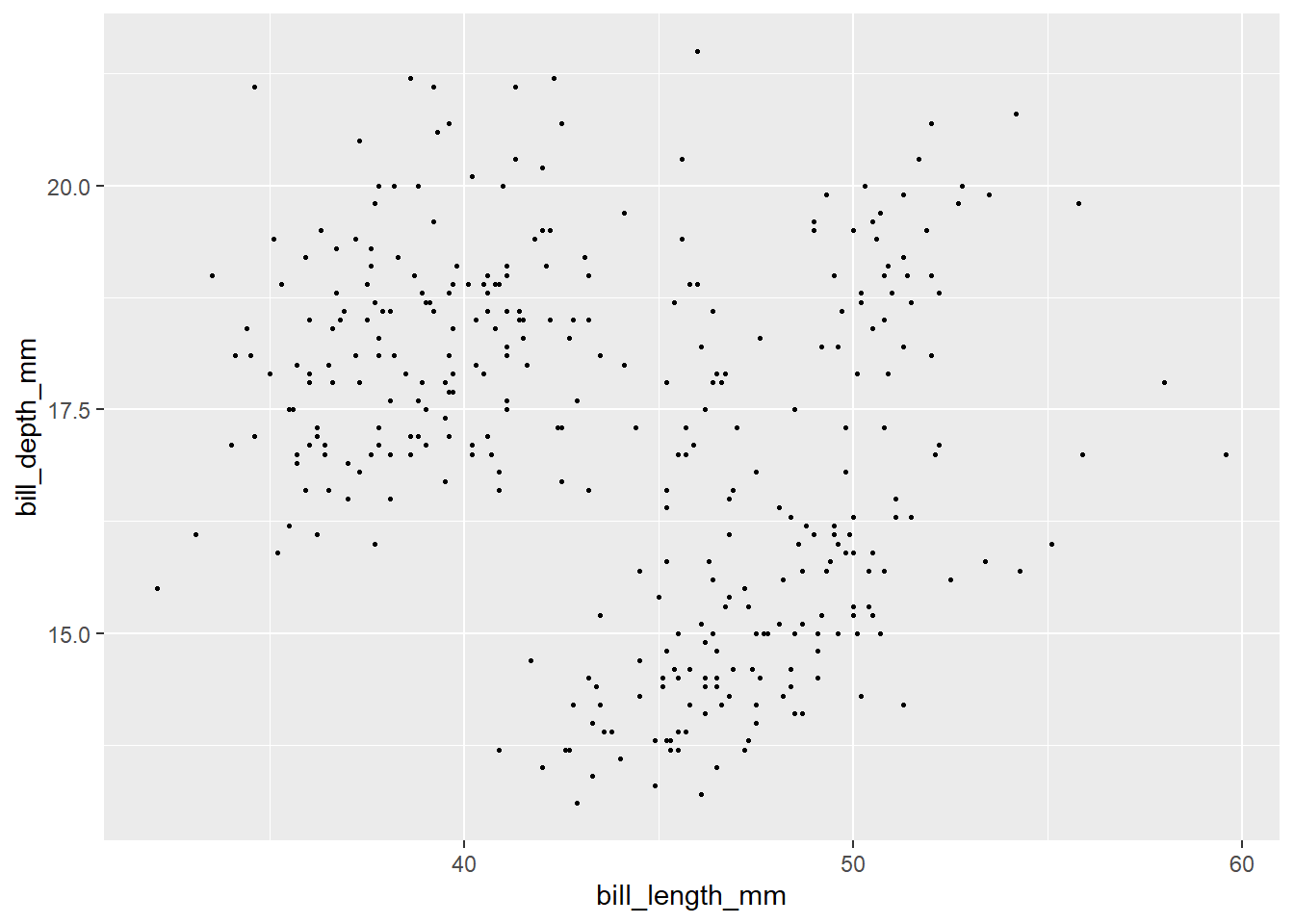
We can also change the color of the dots using the color parameter of the geom_point() function:
ggplot(data = penguins, aes(x = bill_length_mm, y = bill_depth_mm)) +
  geom_point(color = "steelblue")
## Warning: Removed 2 rows containing missing values (geom_point).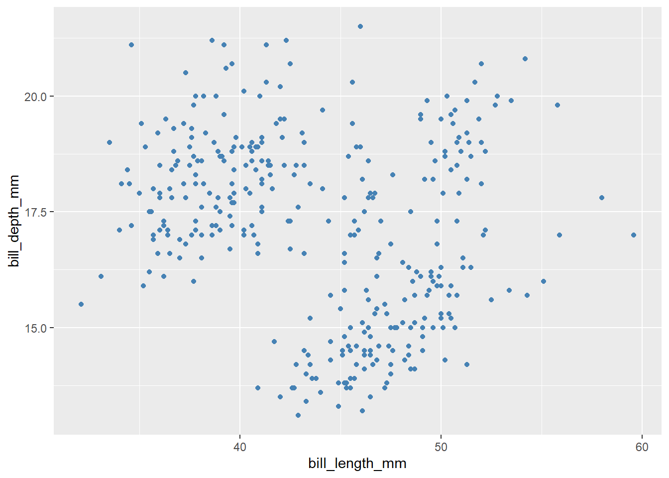
We can change the shape of the dots using the shape parameter inside geom_point():
ggplot(data = penguins, aes(x = bill_length_mm, y = bill_depth_mm)) +
  geom_point(shape = 3)
## Warning: Removed 2 rows containing missing values (geom_point).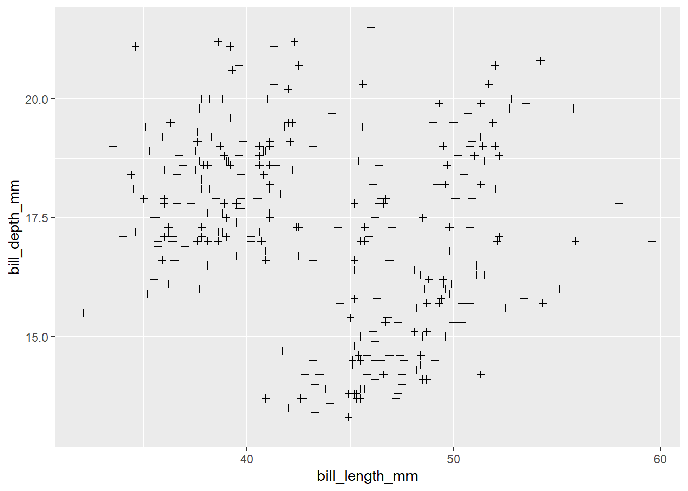
You can have a look at the different shapes available:

The shape 21 is pretty interesting as it allows us to customize the inner color of a dot, its stroke width and its stroke color:
ggplot(data = penguins, aes(x = bill_length_mm, y = bill_depth_mm)) +
  geom_point(shape = 21,
             fill = "blue",
             color = "pink",
             stroke = 2,
             size = 5)
## Warning: Removed 2 rows containing missing values (geom_point).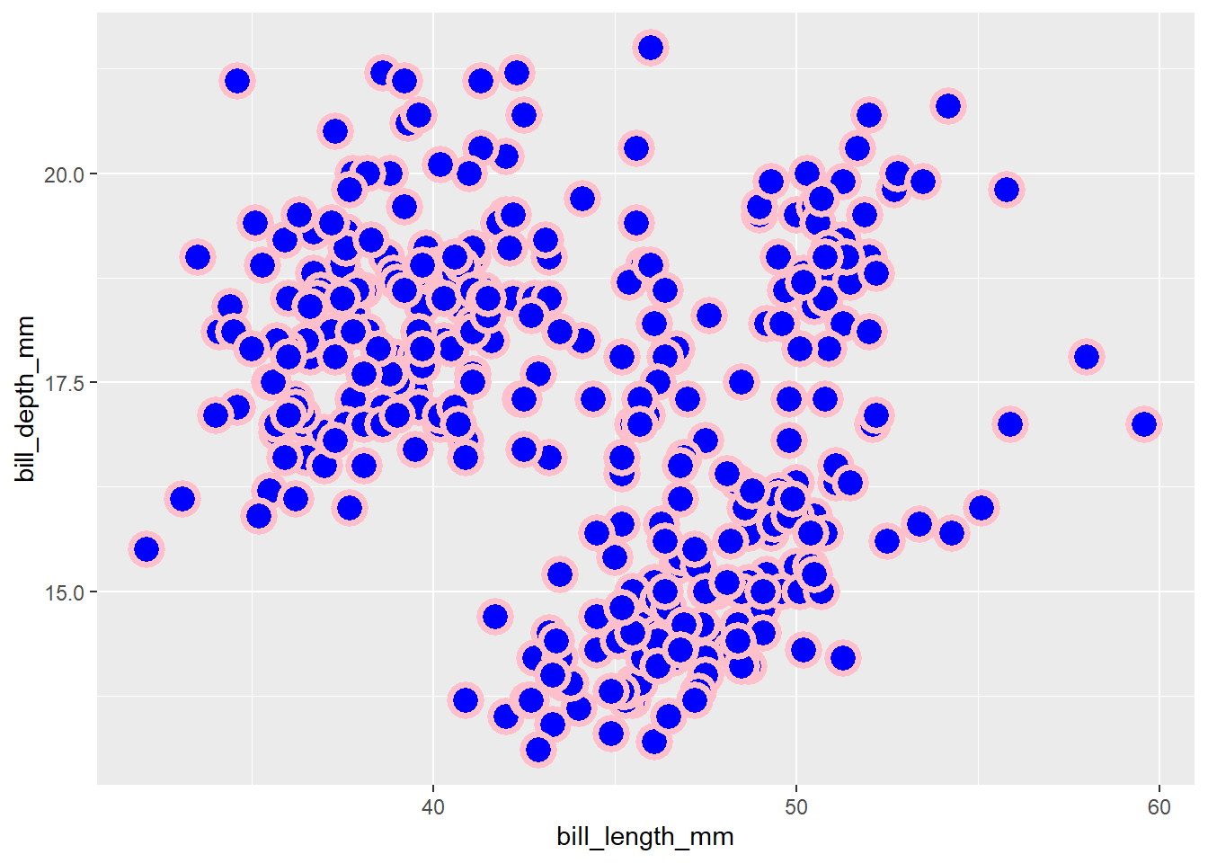
There is also an interesting parameter called alpha which allows us to control the opacity of the color of the dots. Consider the following example from the diamond data frame (data provided by dplyr):
library(dplyr)
## Warning: package 'dplyr' was built under R version 4.1.3
##
## Attaching package: 'dplyr'
## The following objects are masked from 'package:stats':
##
##     filter, lag
## The following objects are masked from 'package:base':
##
##     intersect, setdiff, setequal, union

ggplot(data = diamonds, aes(x = carat, y = price)) +
  geom_point()
The diamonds data frame is relatively big. It contains 53940. That’s why we got this above opaque figure from which it is hard to detect where the concentration of the information lies. Nonetheless, we can use the alpha parameter to decrease the opacity of each dot. Note that alpha takes the values from 0 (full transparent) to 1 (fully opaque):
ggplot(data = diamonds, aes(x = carat, y = price)) +
  geom_point(alpha = 0.01, color = "tomato")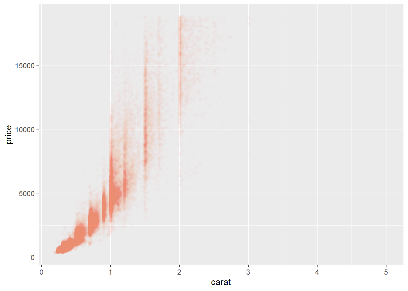
Exercise 1:
🧠 🧠 🧠 🧠 🧠
Q1: Plot the relationship between
flipper_length_mmandbody_mass_g, use thecolor,sizeandshapeparameters.
Q2: Plot the relationship between the
priceand thedepthof thediamonds. Use at lease thecolorand thealphaparameters.
Q3: The
slice_sample()function allows us to extract a random sample from a data frame. Using this function, extract 10% of thediamondsdata frame and plot the relationship betweenpriceandcaret. 🧠 🧠 🧠 🧠 🧠
2. Plot title, subtitle and caption
Let’s say we have the following plot:
ggplot(mpg, aes(hwy, displ)) +
  geom_point()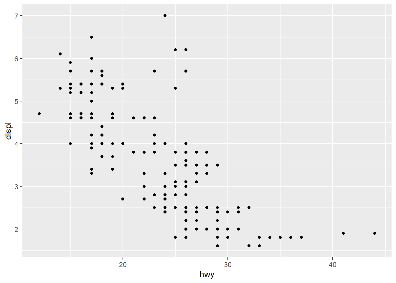
First it needs a title:
ggplot(mpg, aes(hwy, displ)) +
  geom_point() +
  labs(title = "Relationship between hwy and displ")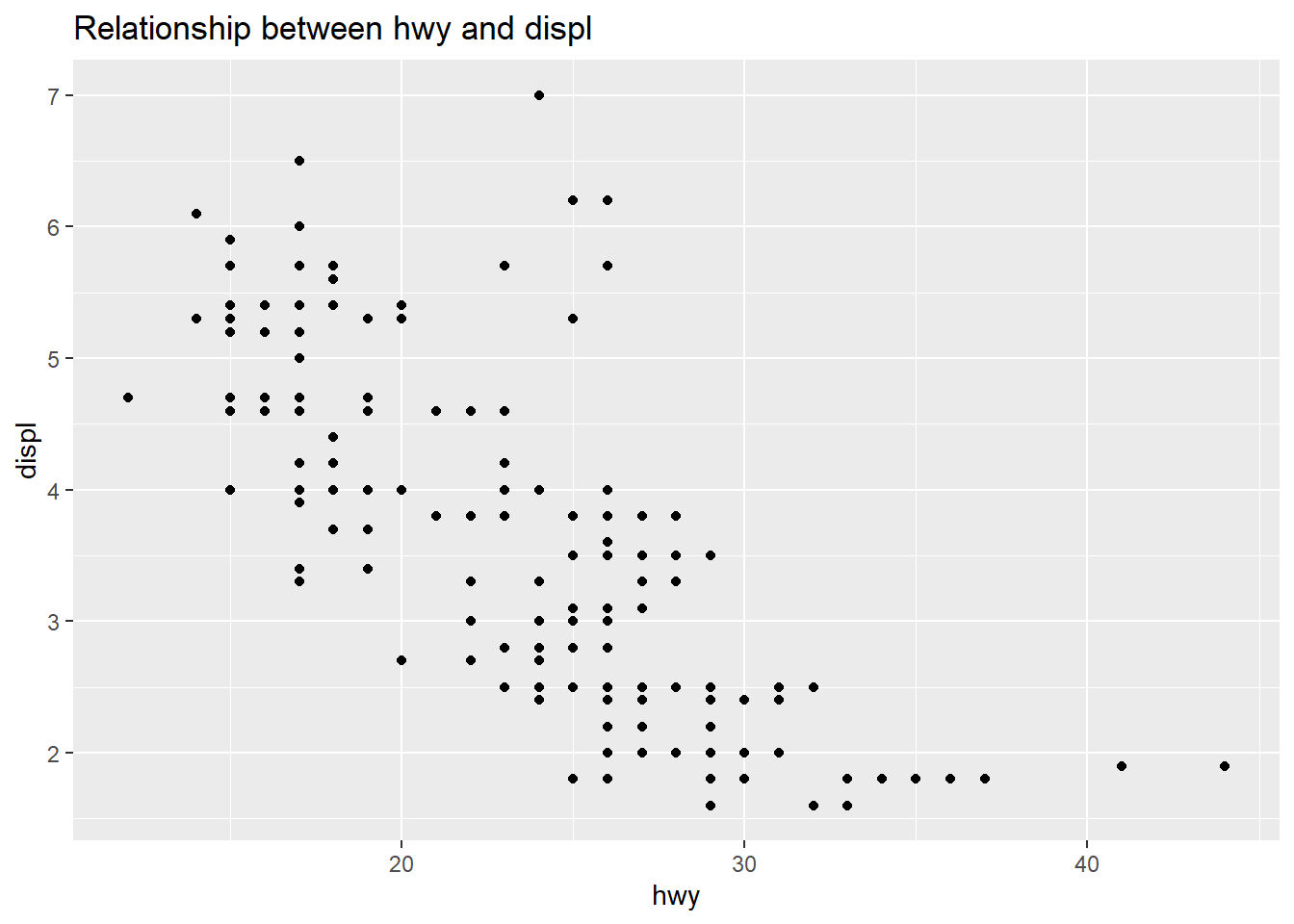
We can add a subtitle as follows:
ggplot(mpg, aes(hwy, displ)) +
  geom_point() +
  labs(title = "Relationship between hwy and displ.",
       subtitle = "The variables come from the mpg data frame")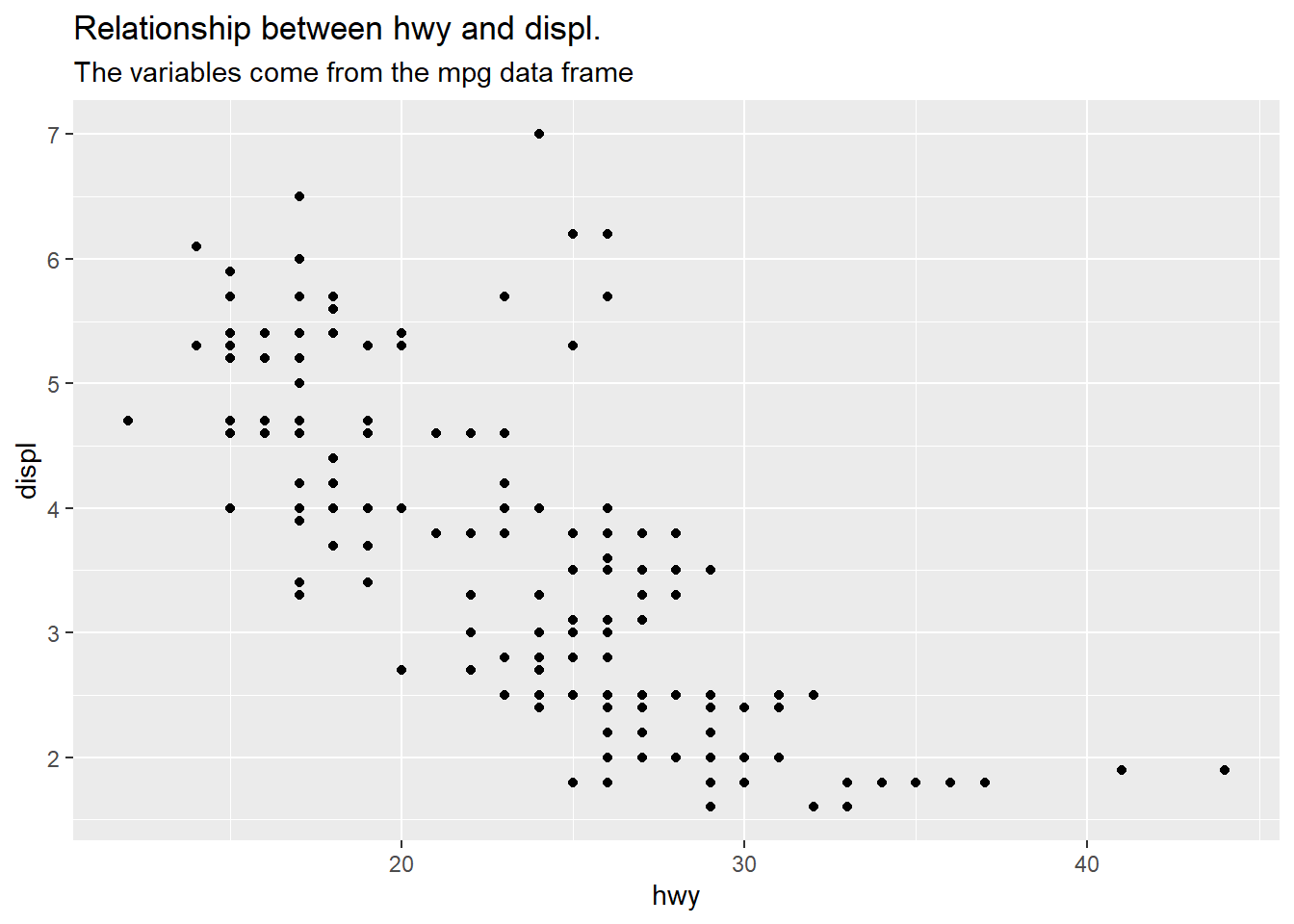
We can also add a caption:
ggplot(mpg, aes(hwy, displ)) +
geom_point() +
labs(title = "Relationship between hwy and displ.",
subtitle = "The variables come from the mpg data frame",
caption = "Made by @moh_fodil for TidyTuesday")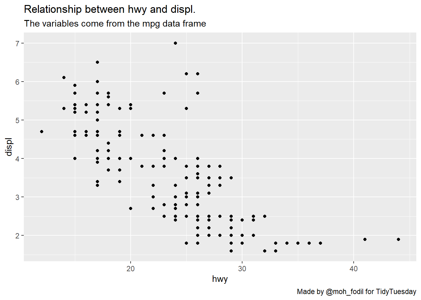 Next, we will modify the title of our axis:
ggplot(mpg, aes(hwy, displ)) +
  geom_point() +
  labs(title = "Relationship between hwy and displ.",
       subtitle = "The variables come from the mpg data frame",
       caption = "Made by @moh_fodil for TidyTuesday",
       x = "Miles Per Gallon in Highway (hwy)",
       y = "engine displacement, in litres (dipl)")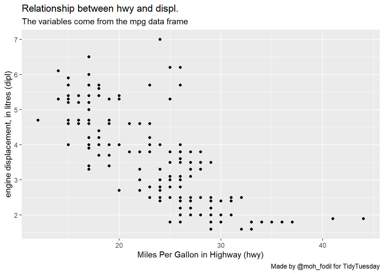
Exercise 2:
🧠 🧠 🧠 🧠 🧠
> Q1: Add titles (main title and axis titles), a subtitle and a caption to your previous plot.
🧠 🧠 🧠 🧠 🧠
3. Adding dimensions
Consider the following scatter plot showcasing the relationship between bill_length_mm and body_mass_g in the penguin data frame:
ggplot(penguins, aes(bill_length_mm, body_mass_g)) +
  geom_point()
## Warning: Removed 2 rows containing missing values (geom_point).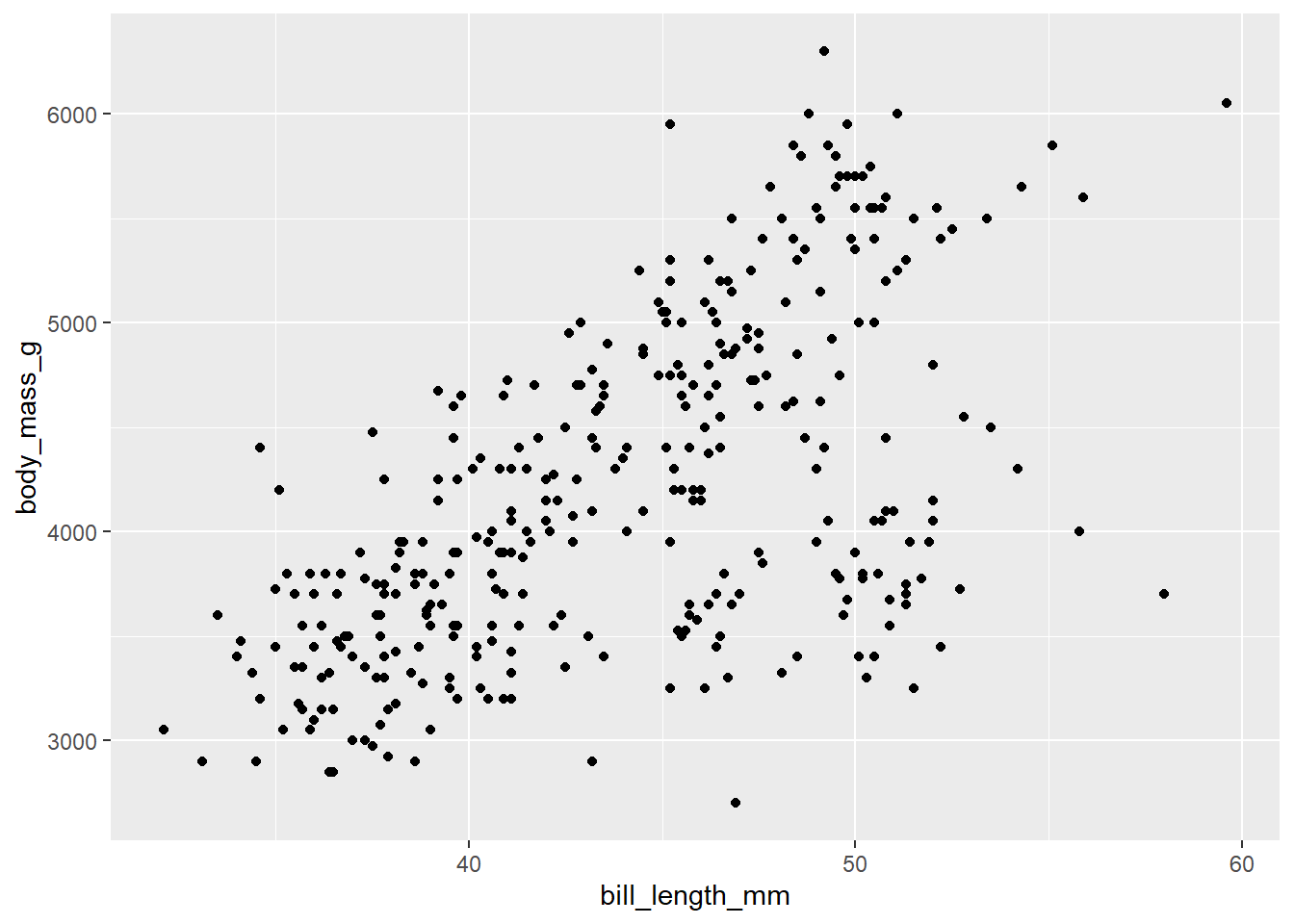
It would be cool if we could spot the different species within the plot. Maybe using the color dimension? It is possible! we just need to use the color parameter inside the aes function (not inside the geom_poit(), see the previous example):
ggplot(penguins, aes(x = bill_length_mm,
                     y = body_mass_g,
                     color = species)) +
  geom_point()
## Warning: Removed 2 rows containing missing values (geom_point).
We can change the color of the
 species legend manually using the scale_color_manuel() function:
ggplot(penguins, aes(x = bill_length_mm,
                     y = body_mass_g,
                     color = species)) +
  geom_point() +
  scale_color_manual(values = c("black", "darkgreen", "blue"))
## Warning: Removed 2 rows containing missing values (geom_point).
We can also rely on one of the many scales that ggplot2 provides. There is an interesting set of color palletes that belong to the so called color brewer family. You can have a look at the available pallets here:
ggplot(penguins, aes(x = bill_length_mm,
                     y = body_mass_g,
                     color = species)) +
  geom_point() +
  scale_color_brewer(type = "qual", palette = "Dark2")
## Warning: Removed 2 rows containing missing values (geom_point).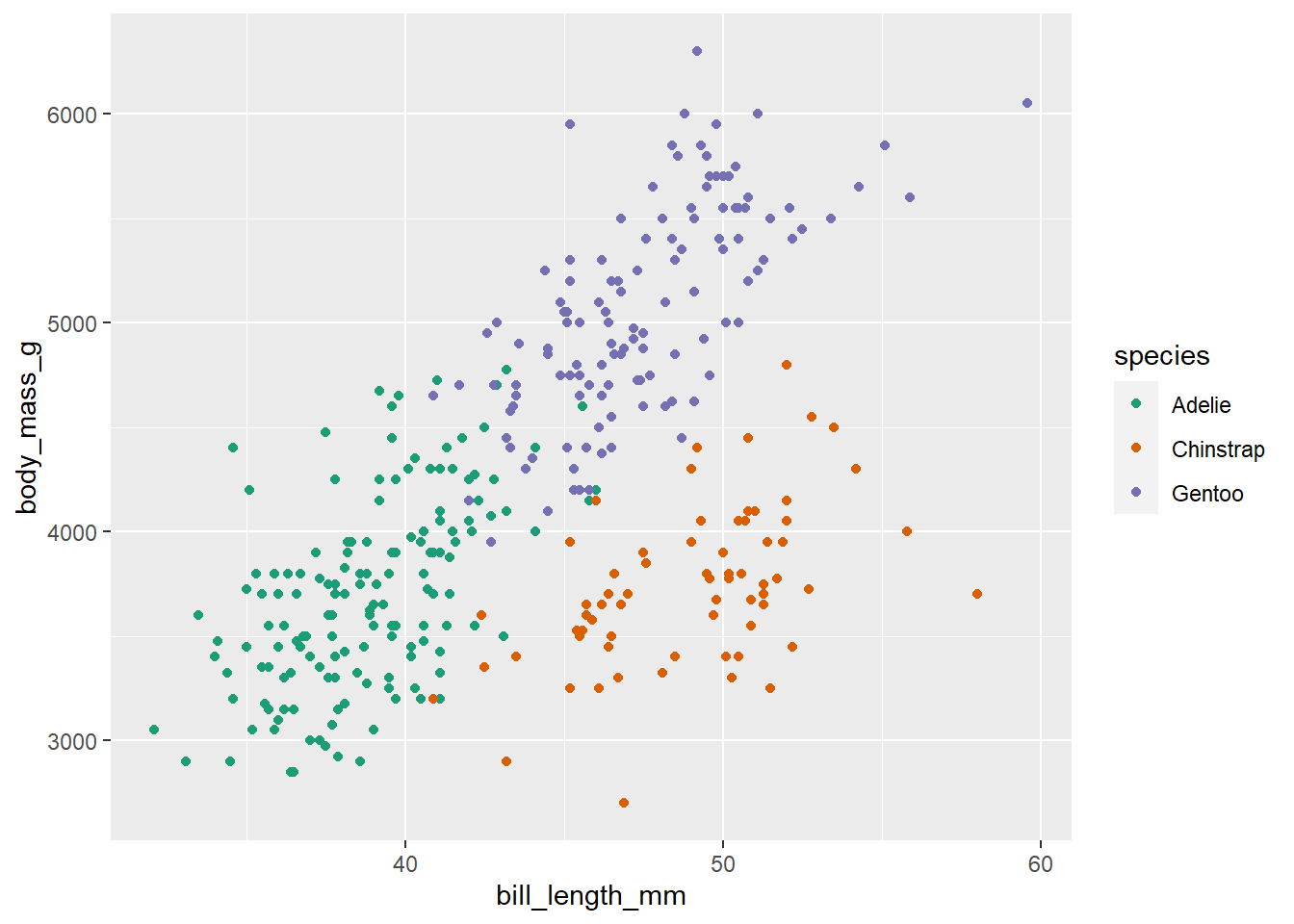
It is also possible to add a size dimension to our graphics using a continuous quantitative variable. In the following example, we use the size parameter (inside the aes() function) to introduce another flipper_length_mm dimension into our plot:
ggplot(penguins, aes(x = bill_length_mm,
y = body_mass_g,
size = flipper_length_mm)) +
geom_point(alpha = 0.5) +
scale_color_brewer(type = "qual", palette = "Dark2")
## Warning: Removed 2 rows containing missing values (geom_point).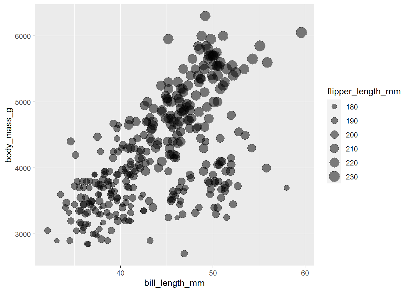 Of course, we can introduce both the color and size dimensions into one plot:
ggplot(penguins, aes(x = bill_length_mm,
                     y = body_mass_g,
                     color = species,
                     size = flipper_length_mm)) +
  geom_point(alpha = 0.5) +
  scale_color_brewer(type = "qual", palette = "Dark2")
## Warning: Removed 2 rows containing missing values (geom_point).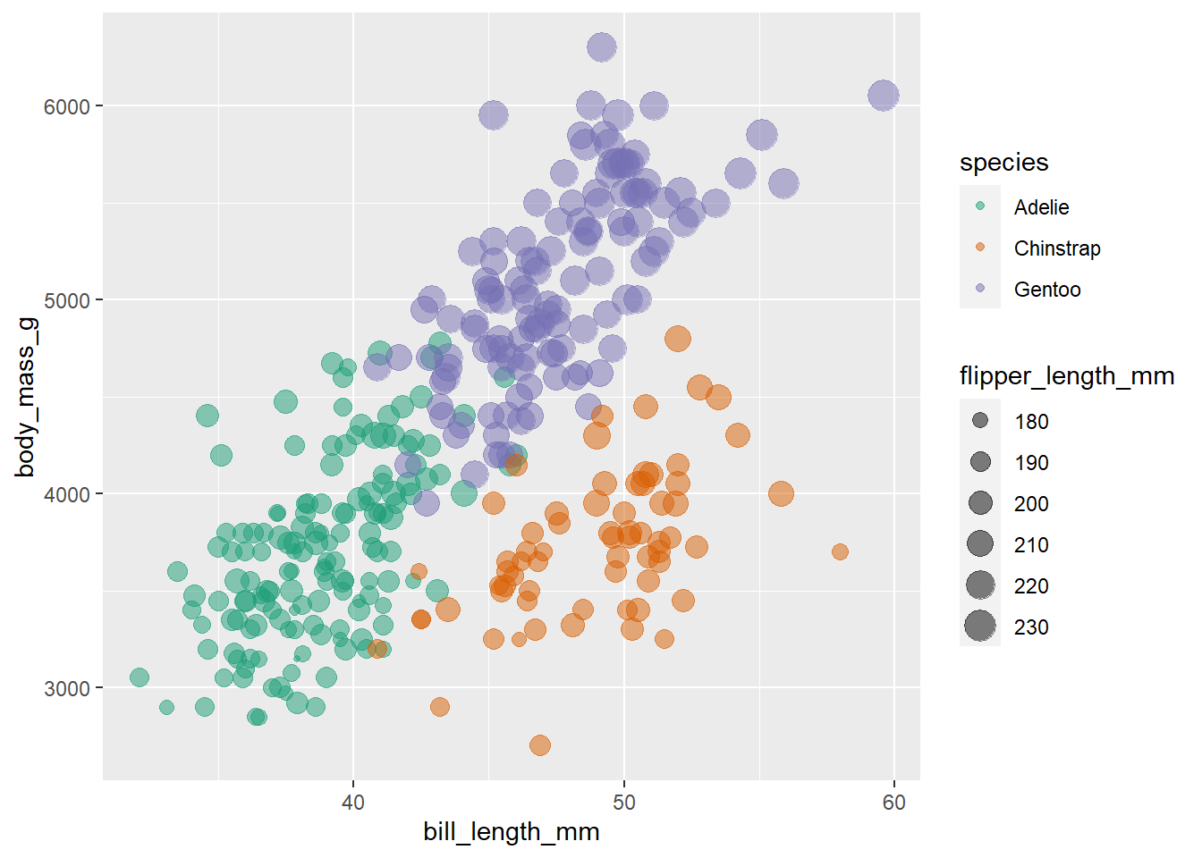
We can easily change the title of our color and size legends using the labs():
ggplot(penguins, aes(x = bill_length_mm,
y = body_mass_g,
color = species,
size = flipper_length_mm)) +
geom_point(alpha = 0.5) +
scale_color_brewer(type = "qual", palette = "Dark2") +
labs(color = "Penguin Species",
size = "Flipper length")
## Warning: Removed 2 rows containing missing values (geom_point).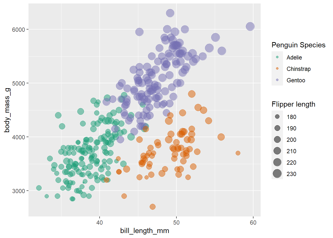 We can get crazier and add another dimension to our scatter plot using the
 shape parameter (again it must be set inside the aes(), don’t put it inside the geom_point()). Suppose for example, that we want to detect the island of each penguin from our plot:
p1 <- ggplot(penguins, aes(x = bill_length_mm,
                     y = body_mass_g,
                     color = species,
                     size = flipper_length_mm,
                     shape = island)) +
  geom_point(alpha = 0.5) +
  scale_color_brewer(type = "qual", palette = "Dark2") +
  labs(color = "Penguin Species",
       size = "Flipper length")